Menu
Identity
Print
Web
About
Contact
All
Branding
Print
Web
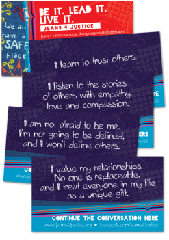
Jeans 4 Justice | Conversation Cards
Print
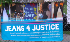
Jeans 4 Justice Event Banners
Print
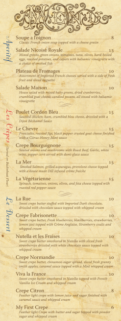
Fabrisons Authentic French Cafe and Creperie | Table and Dinner Menu
Print
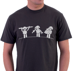
Author Discover Curate | T-shirt Design
Print
MindTouch Event Banners
Print
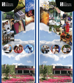
City of Sterling Heights | Event Banner
Print
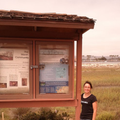
Kiosk Design SDRPF
Print
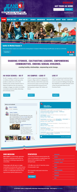
Web Design | Jeans 4 Justice
Web
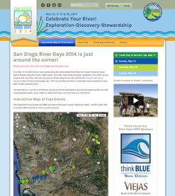
San Diego River Days Web Design | SDRPF
Web
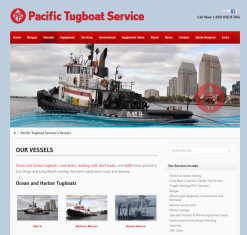
Pacific Tugboat Services
Web
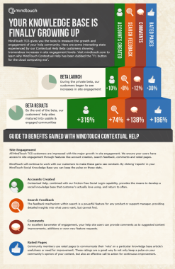
MindTouch, Inc. Infographs
Web
Melissa V. King | Logo
Branding
Jeans 4 Justice | Branding
Branding
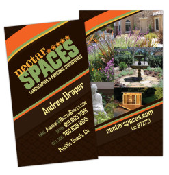
Nectar Spaces
Branding
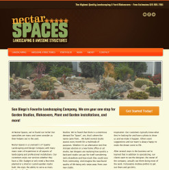
Nectar Spaces Web Design
Web
Community EO Logo
Branding
Bedrock Boulders Web Design
Web
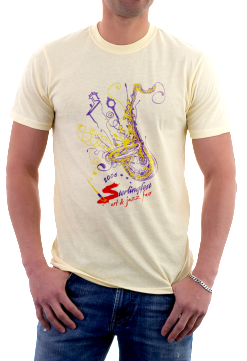
Sterlingfest 2006 | T-shirt Design
Print
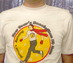
Hanson’s Running | T-shirt
Print